Product Client Fit And Client Behaviour
Disclaimer: The purpose of this post is to demonstrate the logic and the methodology, model choice, etc. The features and predicted products have been totally anonymized and partially scrambled by the author. Demonstrated results cannot be perceived or interpreted as real data of any financial organization.
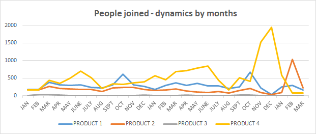
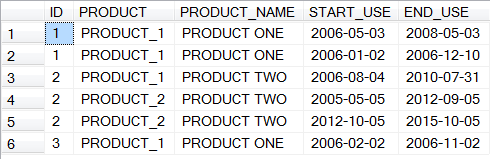
This case is similar to the previous one (product client fit), however, both the product and the dataset are different. This is data for two years and 3 months, and there definitely is a seasonal dynamic to it - clear “downs” are january and august; Product 3 basically is the same all the time with no dynamic to look at Something major definitely happened in pre-NY time, end of year 2 However, the question is - is this peak really so many new clients coming in? If there are a lot of leavers, too, then there could be a major restructuring and the contracts were re-signed (thus the peak is artificial) Same clients bought products for the second/third time (two credit cards, two deposits etc.) Here for client 1 product one was bought twice (and with an overlap), and for client 2 product 2 was bought twice (without an overlap). The setting is very similar to the « product client fit » case, however the data itself is different, also there is only one target variable predicted (one product instead of 7). Here there’s no feature engineering at this point, I’m simply dropping out the missing values, then checking there are no NaNs in any of the variables. This can be done as there were about 206 000 lines in the dataset originally, and after dropping missing ones there are about 196 000 left (doesn’t drastically reduce the sample). First, as before, correlations between variables. This time, I’m not inputting the train / test files separately, but using a more conventional method. As a baseline, I’m using two models – Random Forest and XGBoost (Gradient Boosting trees, same as in the Santander case however with no pre-set parameters, as in Santander specific items such as tree depth, evaluation metric, N of rounds, etc. were indicated upon calling the classifier). Then, the scores. Random forest: One thing that can be seen from this is that by increasing N of folds the score increases (being higher for RF than for XGB all the way). Back to the graph with three features that have no importance. To find out the reasons, what I did is consecutively run the model and constructed the graph first for those three, then for four, then five, adding variables to see when the importance drops to 0. Some code can be found here.
In this case it’s interesting to concentrate more on the behavior of the clients first, see what is happening if looking at time dynamic.
The features and products, as before, are anonymized completely.
Here I’ll also demonstrate the logic of the SQL code I’ve made extractions for graphs with. (All the data in examples is randomly generated.)
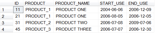
This is a table of source data, from which the first idea is to group how many clients use each product to get a break down. But there’s also time - how many clients start/stop using the product as time goes on? Are there any patterns?
Code is straightforward:</p>
SELECT        id, product, product_name,

CASE WHEN start_use >= '2006-01-01' AND start_use <= '2006-01-31' THEN 1 ELSE 0 END AS January06_new,

CASE WHEN start_use >= '2006-02-01' AND start_use <= '2006-02-28' THEN 1 ELSE 0 END AS February06_new,

…...

CASE WHEN start_use >= '2006-11-01' AND start_use <= '2006-11-30' THEN 1 ELSE 0 END AS November06_new,

CASE WHEN start_use >= '2006-12-01' AND start_use <= '2006-12-31' THEN 1 ELSE 0 END AS December06_new

FROM  products
First graph is the dynamic of people who joined (bought the product) each month, and
We can clearly see that:
Instead, it could be:
In SQL it’s possible to count the times client bought and dropped a particular product and if both/either were more than once, tag the client as “multiple user” as a separate feature in the dataset.
Also, it’s obviously worth paying attention to periods which are used for prediction - if the december is predicted, it makes more sense to predict it with december data rather then with the whole year data, for instance.
The target variable
The predicted product is a combination of the four products represented on the graphs above.
“Combination” means that in the data, product 1 is, for example, Card Visa, product 2 is Card Maestro, product 3 is Mastercard Premium, and product 4 is Visa Platinum. If each one of them is a column taking values 0 or 1 (in this task it’s assumed that they are mutually exhaustive), then the “combination” variable would be 1 if customer has at least one of these cards, and 0 if the customer doesn’t have any of them.
The features are anonymized. There are 4 categorical variables (categories customer is in), and ten numerical variables (anything related to their transactions, dynamics by months, overdrafts, fees they pay, etc.)Data prep
dataset.dropna()#dropping empty values

dataset = dataset[pd.notnull(dataset['category_feature1'])] #excluding lines where there is no category_feature1

for i in range(0,12):

   print([cols[i]])

   print(dataset[cols[i]].isnull().sum())

   print(dataset[cols[i]].count())
Here a few things are immediately evident:
- Features 5,6,7 and 8,9 and 10 are very strongly correlated (knowing the dataset there’s a simple explanation for that- this is a time dynamic of the same variable)
- String correlation between numerical features 1 &2 (this is in fact minimum and maximum of the same indicator, which can change for a client during his stay with the bank)
- Categorical variables 1& 2 and 1 &4 are moderately correlated (this could be structure, meaning category 1 is the top variable, for example client types, category 2 is types by income, category 3 is types by income by region, and so forth)The model(s)
X_train, X_test, y_train, y_test = train_test_split(dataset[cols], dataset[target], test_size = 0.3, random_state=42)random_forest1 = RandomForestClassifier()
random_forest1.fit(X_train, y_train.values.ravel()) #fitting
y_pred= random_forest1.predict(X_test) #predicting
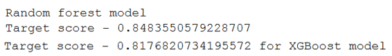
print("Target score - " + str(metrics.accuracy_score(y_test, y_pred)) )#model score for target vaiablexgb_model1 = XGBClassifier()
xgb_model1.fit(X_train, y_train.values.ravel())
y_pred = xgb_model1.predict(X_test) # make predictions for test data
accuracy = accuracy_score(y_test, y_pred) #accuracy score
print("Target score - " + str(accuracy)+" for XGBoost model" )#model score for target vaiable
Not at all bad. However, the scores alone are not enough. First of all, we have to check how strong the signal is and how many clients in our sample actually did buy the product.
About 23% percent of the clients, that is to say, each fifth client, has this product. Here it has to be said that for this problem only clients who do have this product now were used (not those who bought it but have an “end date” which is in the past, but those who use it presently).
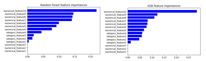
Then, variables importance.
Here there’s no difference in the order, but there’s one thing capturing the attention immediately – three features (numerical features 1 to 3) do not have any importance at all. First I thought it’s a Python mistake, but it’s not, and we’ll look into that later.
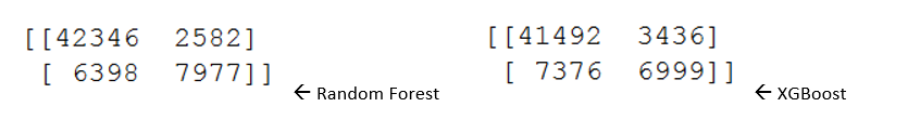
As can be seen from the scores, XGB performs worse than Random Forest. Let’s look at other model evaluation metrics. First, the so-called “confusion matrix”.
The “confusion matrix” is read and interpreted as follows – TP (true positive, top left) are people who actually buy the product, and are predicted to buy the product correctly. FP (false positive, or type 1 error, top right) are people who did not buy the product, however were predicted to buy it. For XGB it’s higher, which makes sense as the model score is lower (model predicts far too many people who would buy the product incorrectly). False negative, FN (bottom left, type 2 error) are people who are predicted not to buy the product but actually they did buy it. Finally, True negative is when the people did not buy the product and were predicted not to buy it.
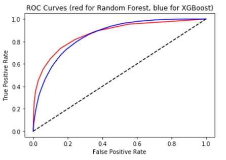
Along with that, it makes sense to construct a ROC AUC curve.
The ROC curve is created by plotting the true positive rate (TPR) against the false positive rate (FPR) at various threshold settings. The true-positive rate (y axis) is also known as sensitivity the false-positive rate (x axis) is also known as the fall-out or probability of false alarm.
TPR is calculated by dividing true positive results (42346 for rf) on sum of first column of confusion matrix (everyone buying the product – 42346+6398 for rf).
FPR is calculated by dividing false positive results (2582 for rf) on sum of second column of confusion matrix(everyone who did not buy the product – 2582+7977 for rf).
AUC is the area under the curve.#ROC AUC curve for random forest model and for XGBoost model - together
y_pred_prob = random_forest1.predict_proba(X_test)[:,1] # Compute predicted probabilities: y_pred_prob
fpr, tpr, thresholds = roc_curve(y_test, y_pred_prob) # Generate ROC curve values: fpr, tpr, thresholds RF
y_pred_prob1 = xgb_model1.predict_proba(X_test)[:,1] # Compute predicted probabilities: y_pred_prob
fpr1, tpr1, thresholds1 = roc_curve(y_test, y_pred_prob1) # Generate ROC curve values: fpr, tpr, thresholds XGB
# Plot ROC curve
plt.plot([0, 1], [0, 1], 'k--')
plt.plot(fpr, tpr, color='red')
plt.plot(fpr1, tpr1, color='blue')
plt.xlabel('False Positive Rate')
plt.ylabel('True Positive Rate')
plt.title('ROC Curves (red for Random Forest, blue for XGBoost)')
plt.show()
One of model validation tools that I haven’t yet shown in the blog, but an important and widely used one, is cross validation. It’s regarded as a solution to overfitting. In cross-validation, fixed number of folds (or partitions) of the data is made, then the analysis on each fold is run, and then average the overall error estimate is produced. The question is – what is the optimal number of folds?#Cross validation for random forest
cv_scores_rd10 = cross_val_score(random_forest1,dataset[cols],dataset[target],cv=10)
print("Average 10-Fold CV Score for random forest: {}".format(np.mean(cv_scores_rd10)))
cv_scores_rd20 = cross_val_score(random_forest1,dataset[cols],dataset[target],cv=20)
print("Average 20-Fold CV Score for random forest: {}".format(np.mean(cv_scores_rd20)))
cv_scores_rd30 = cross_val_score(random_forest1,dataset[cols],dataset[target],cv=30)
print("Average 30-Fold CV Score for random forest: {}".format(np.mean(cv_scores_rd30)))
XGBoost:
Features with no predictive power
Up to 11 variables, these three (or two as first and second are max and min of the same variable and strongly correlated) have importance, however, along with category feature 4 and numeric features 5 to 6, they lose their importance. This is something to investigate.